17.03.2025
LATEST CASE
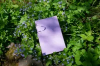
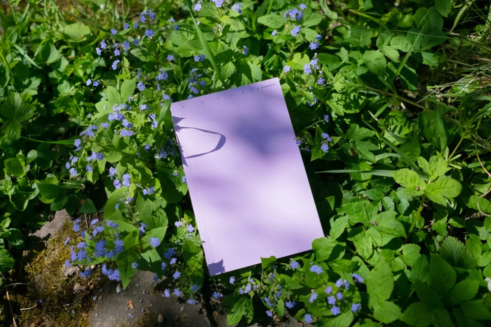
Poetic and tranquil publication with multiple narrative structures.
Case
LATEST CASE
Poetic and tranquil publication with multiple narrative structures.
We are very much looking forward to teach screen design and time-based media at the Stuttgart State Academy of Art and Design as well as typography at the Merz Akademie again this semester.
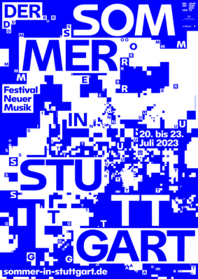
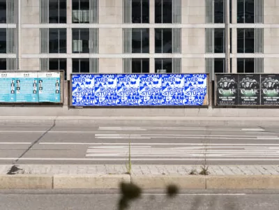
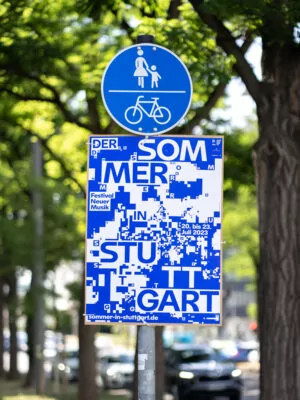
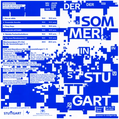
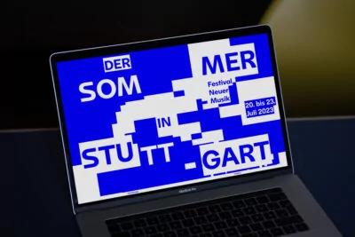
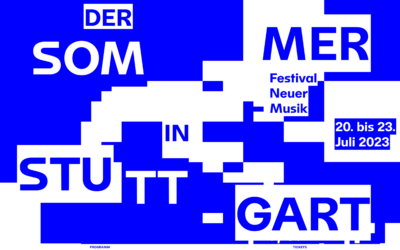
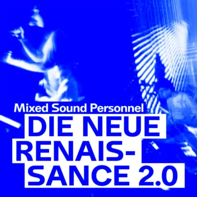
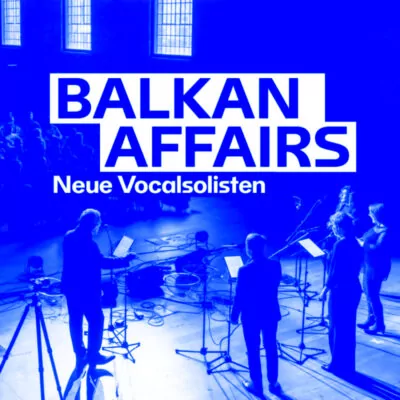
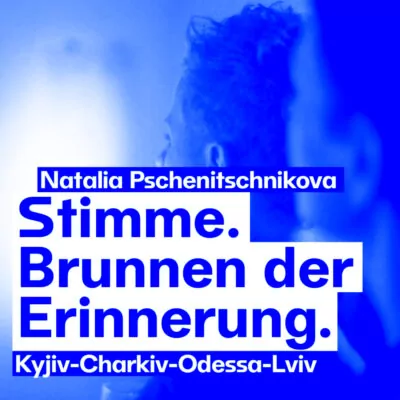
Concert photos set the tone for vibrant visuals and an onomatopoeic typography system that creates a noisy identity for a New Music festival, mirroring its avant-garde soundscapes.
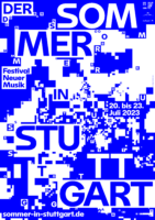
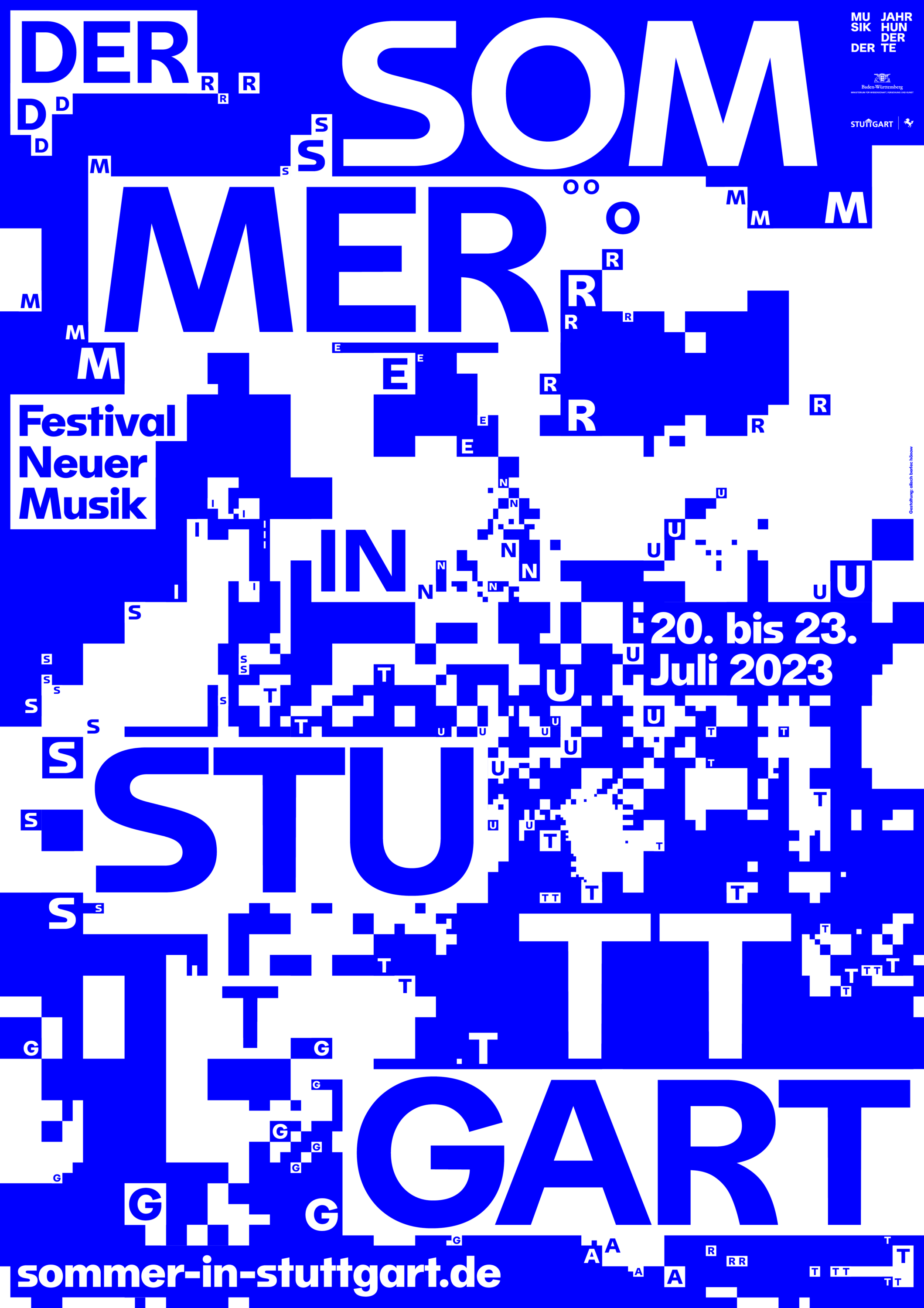
The typography itself is fragmented by a tangled background and repetitive interwoven letters that refer to the experimental and boundary-pushing character of New Music.


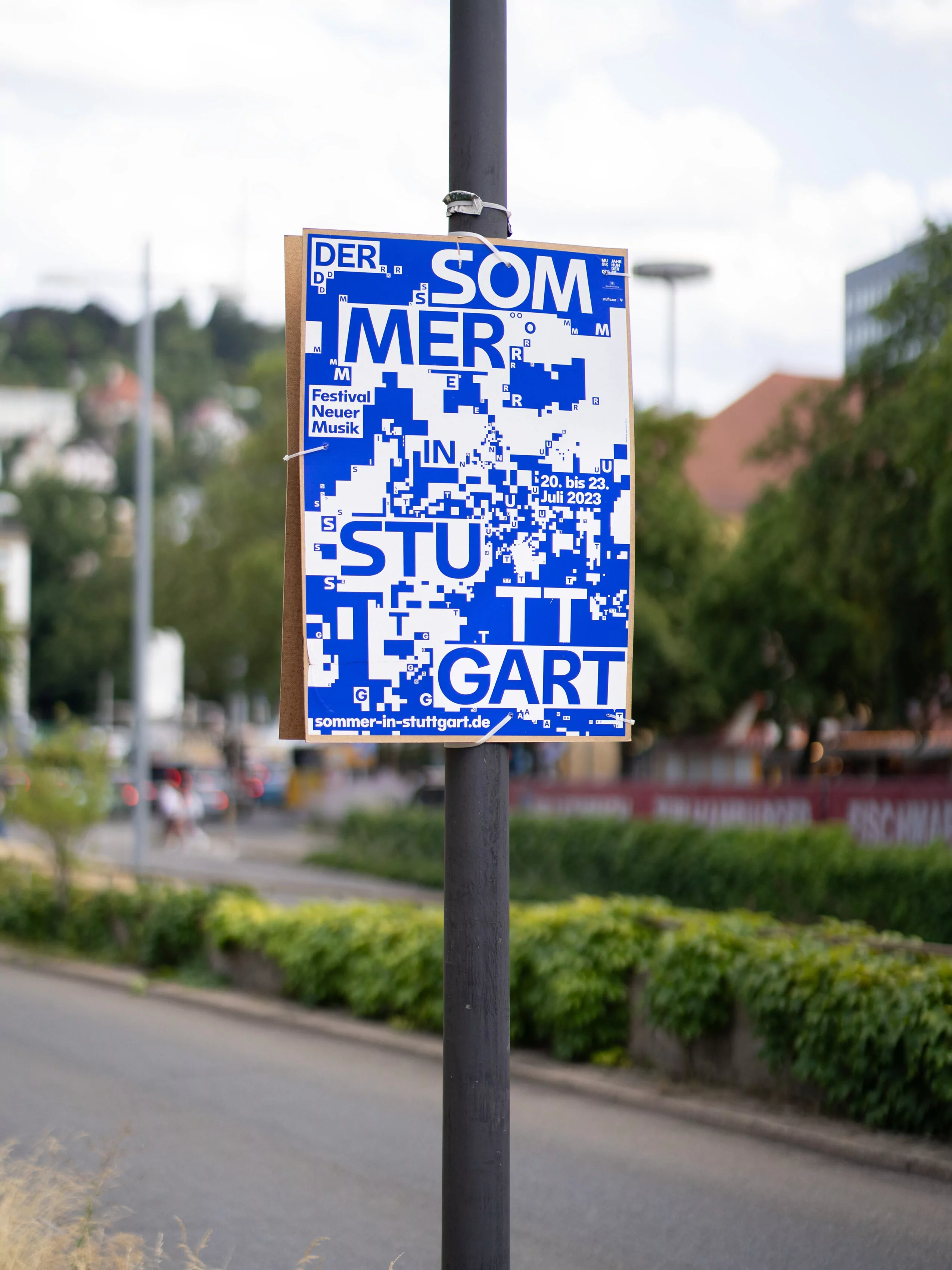


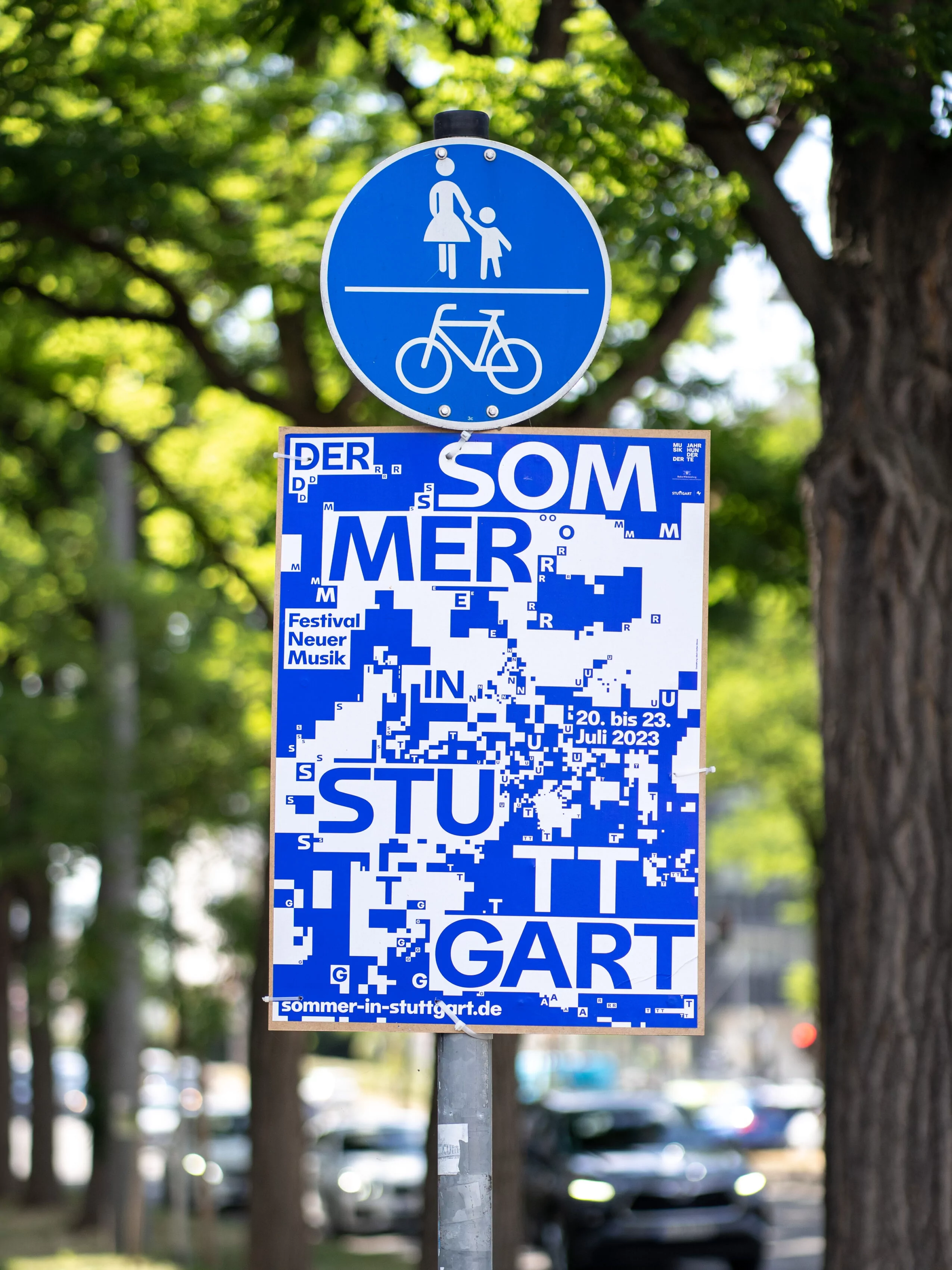
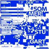
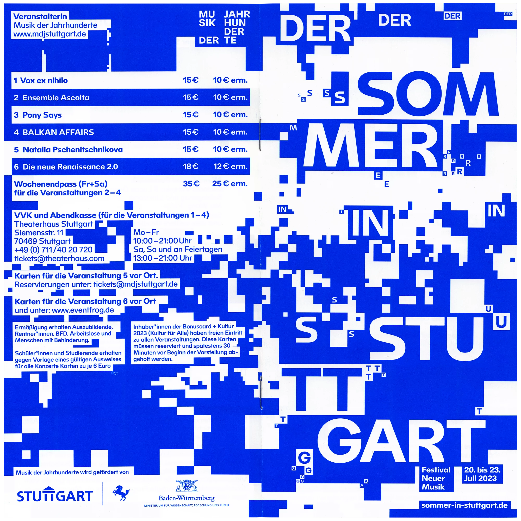
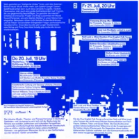
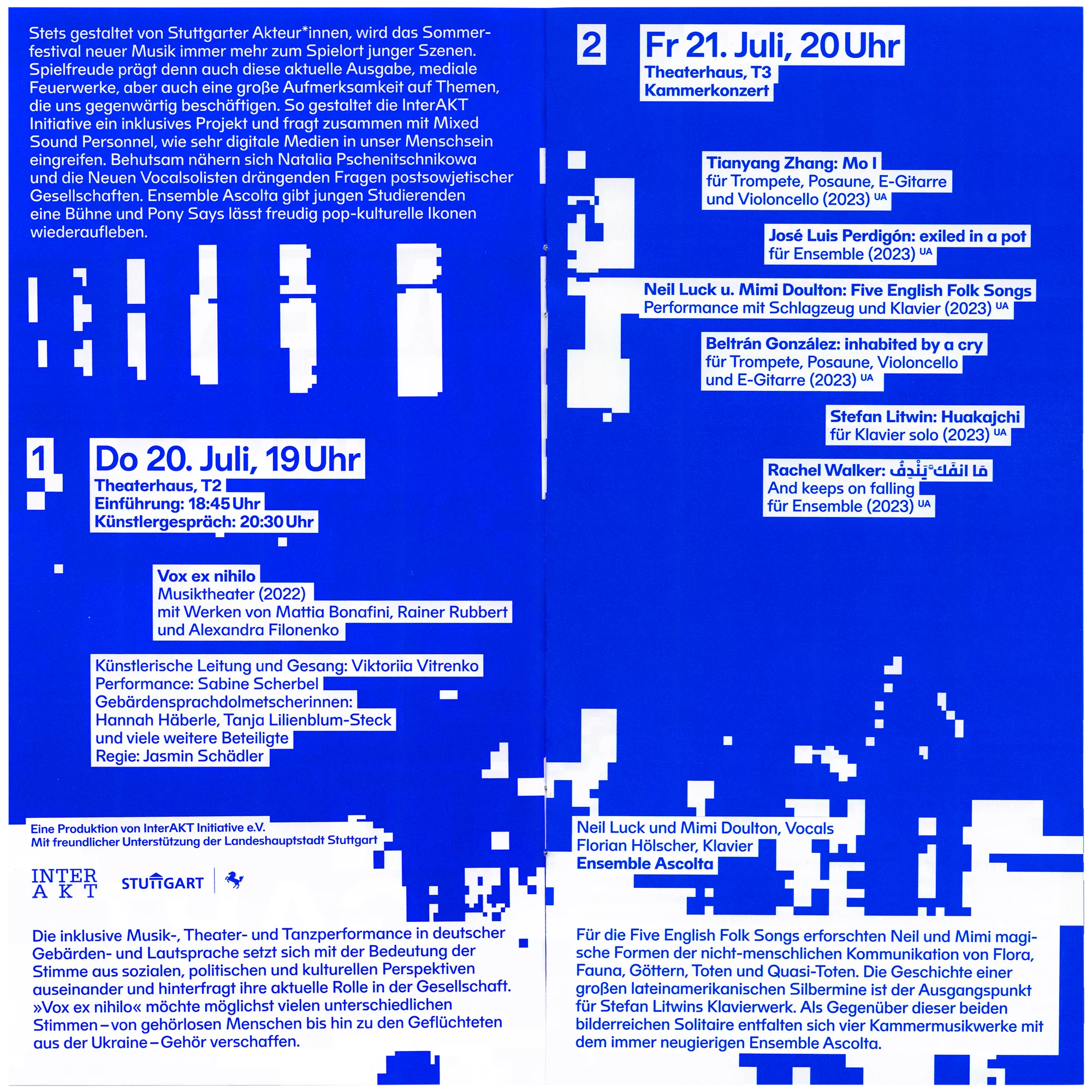
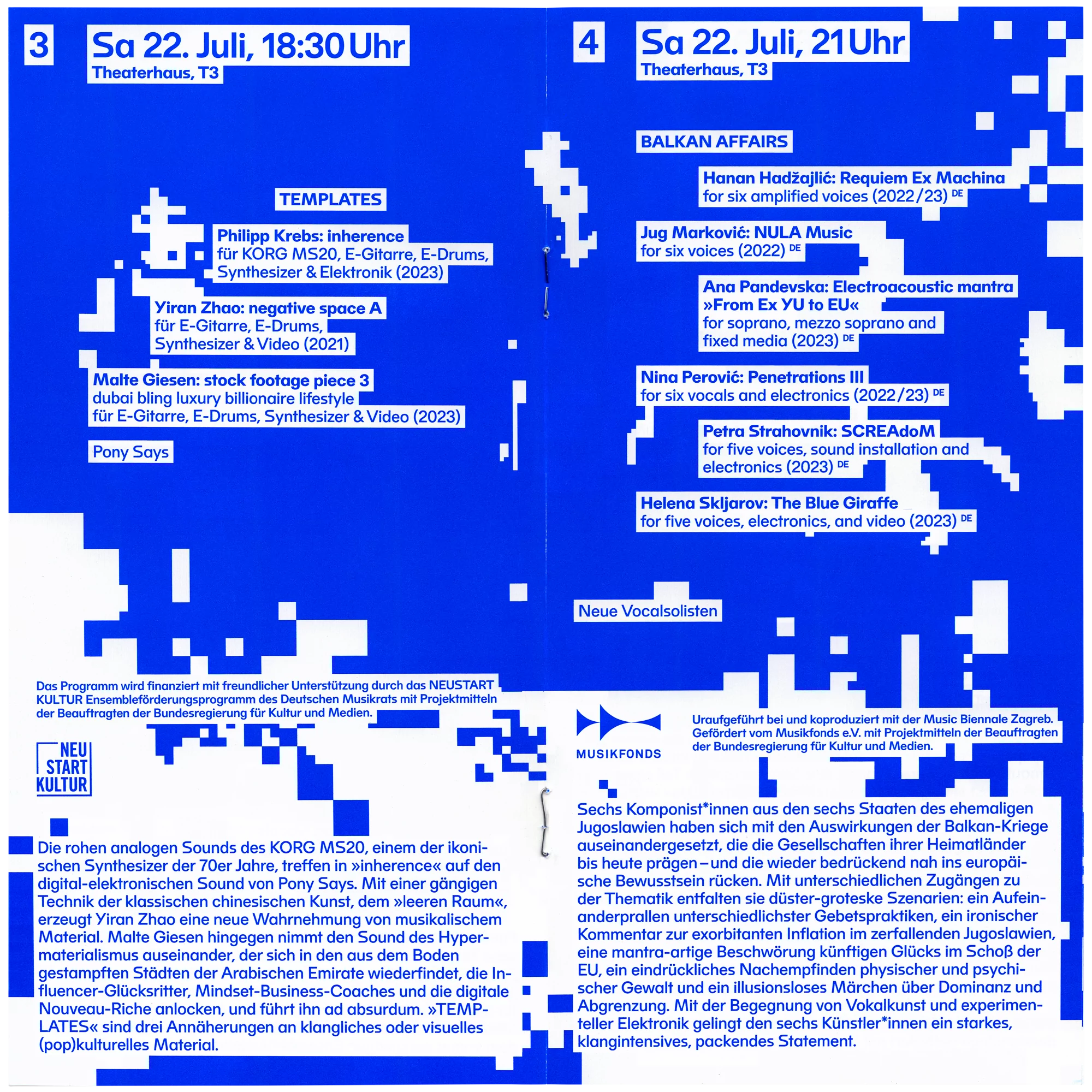
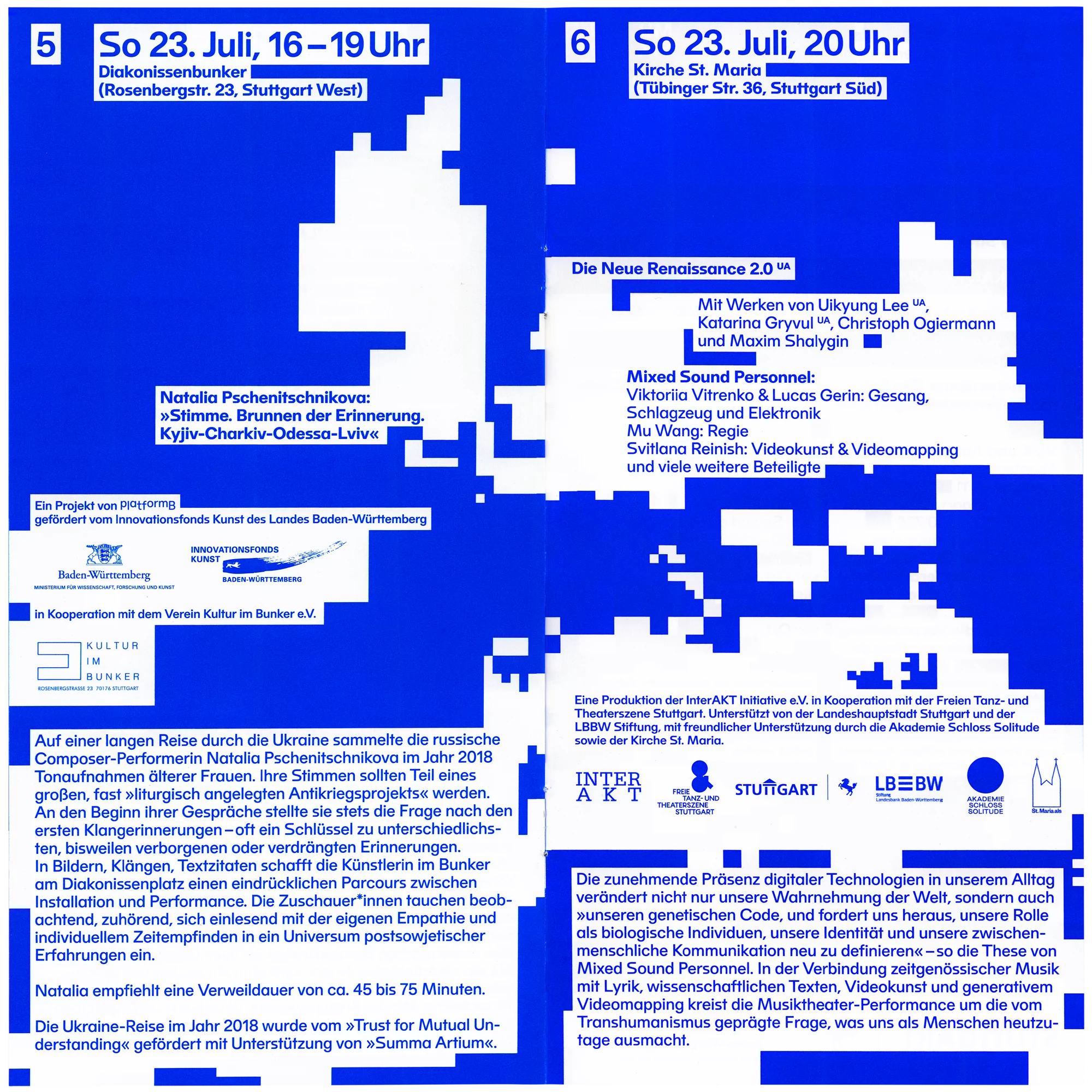
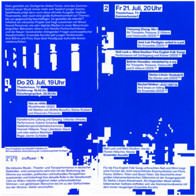
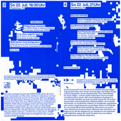
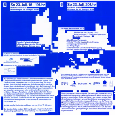
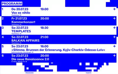
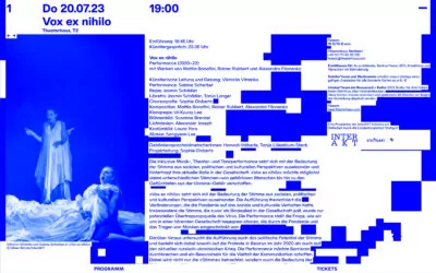
To create even more rhythm in the printed matter, text fields with a white background blend seamlessly into the abstracted concert photographs in the background.

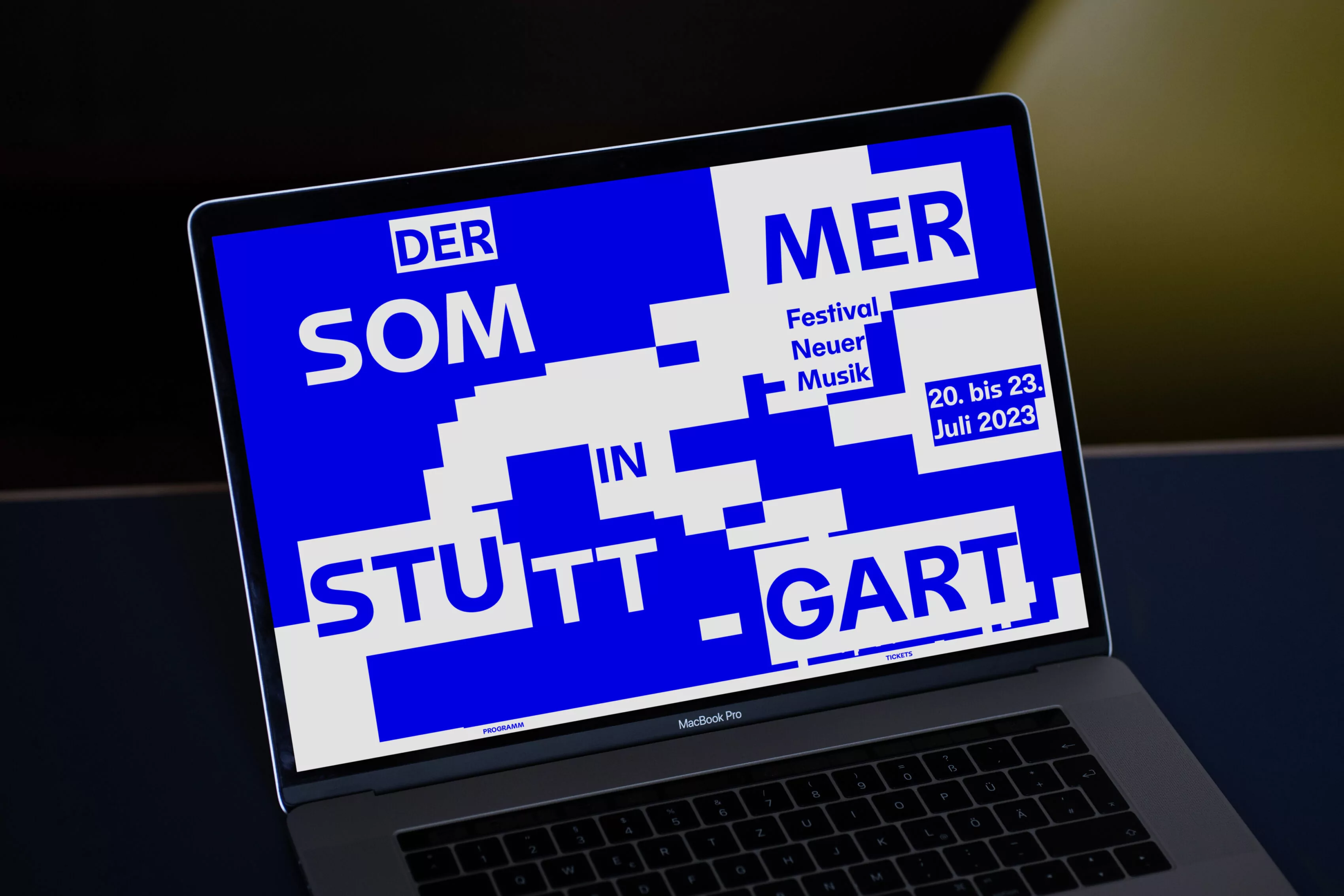
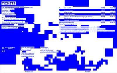
Bringing this rhythmic concept to the digital space, the festival website changes its shape and appearance through interactions such as clicking or moving the mouse pointer.
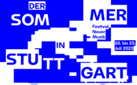
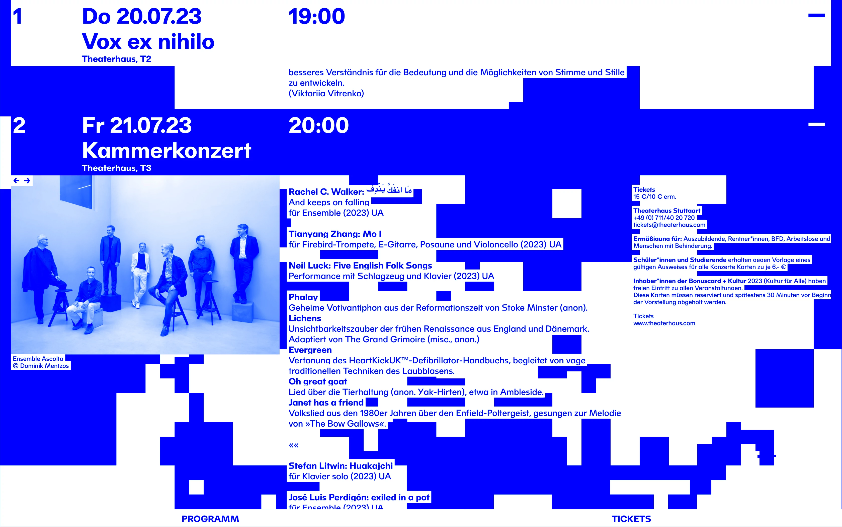
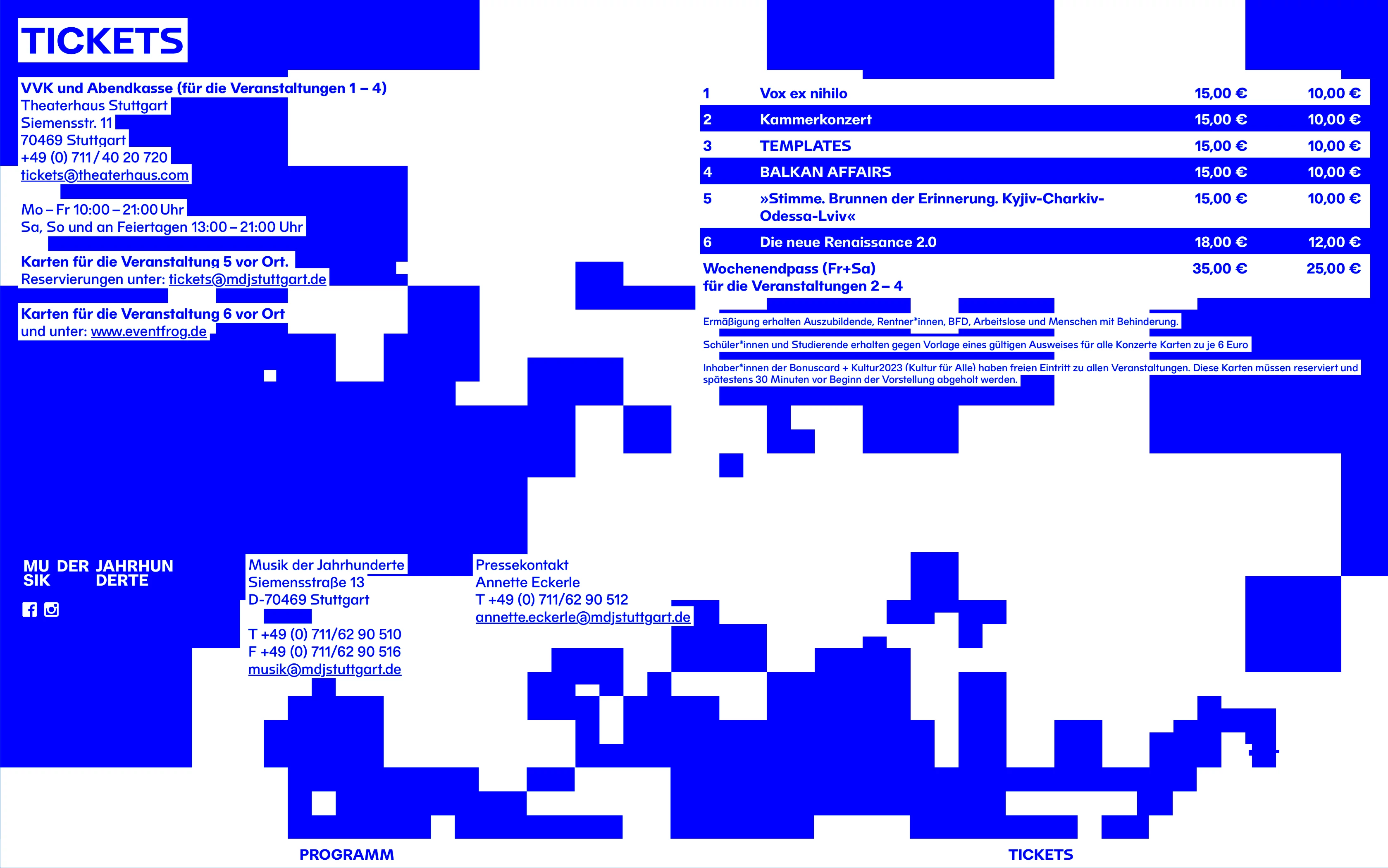

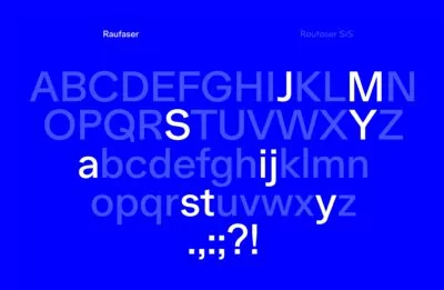
Based on the bespoke typeface Raufaser that was created for the festival initiator’s own identity, a custom stylistic set is drawn to distinguish the festival design from other events while maintaining the brand’s core appearance.
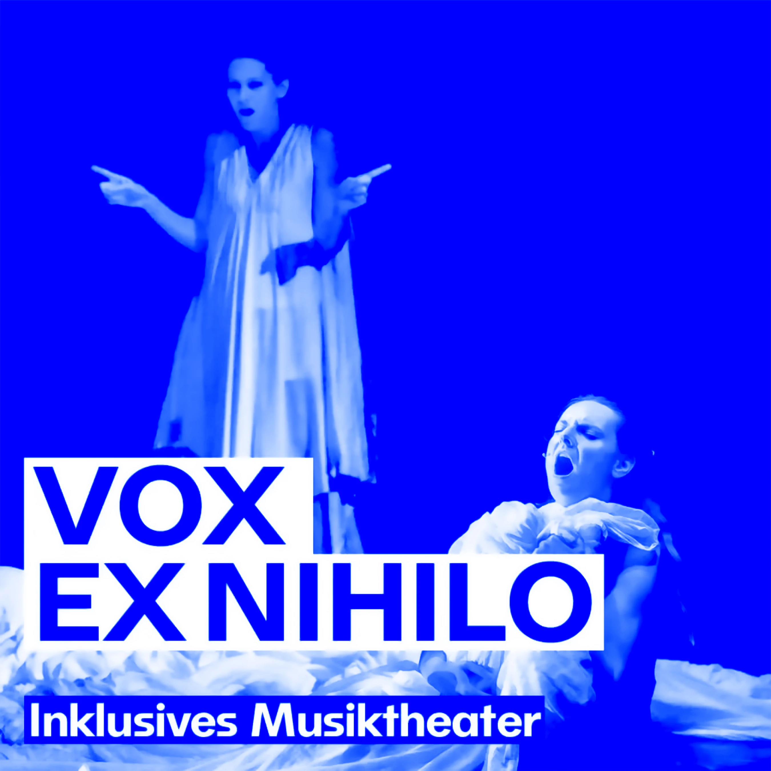
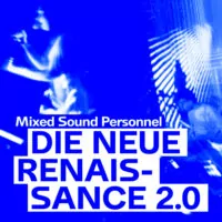

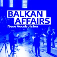
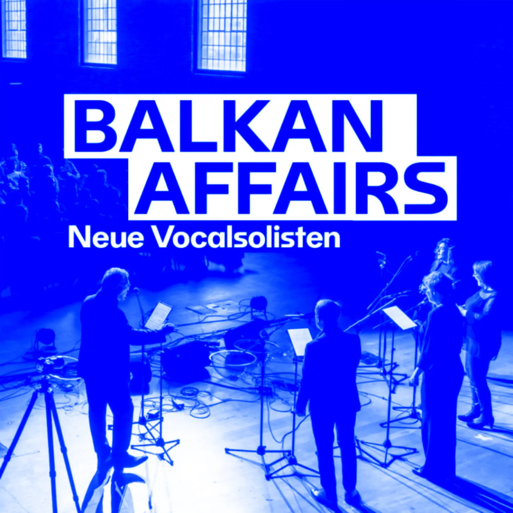
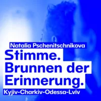
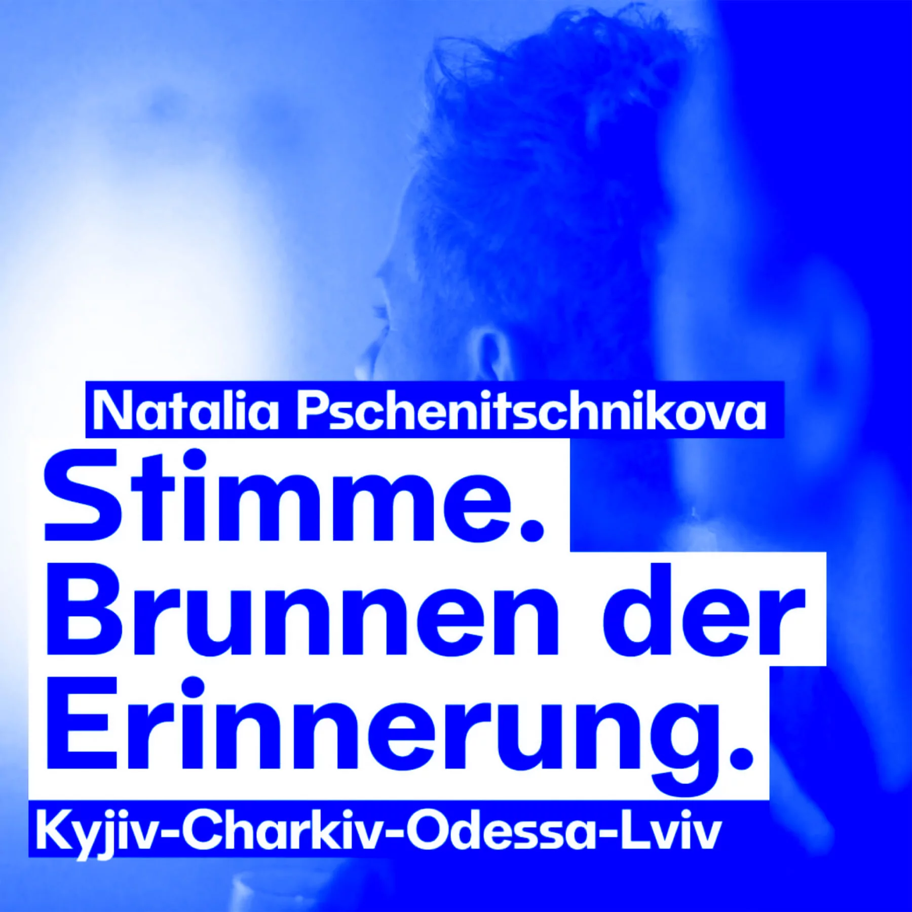
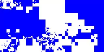
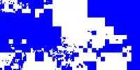
The visual material used on social media is colored in blue in order to create a distinctive visual language that differentiates it from other image-based content on various platforms.
Concert photos set the tone for vibrant visuals and an onomatopoeic typography system that creates a noisy identity for a New Music festival, mirroring its avant-garde soundscapes.
The typography itself is fragmented by a tangled background and repetitive interwoven letters that refer to the experimental and boundary-pushing character of New Music.
To create even more rhythm in the printed matter, text fields with a white background blend seamlessly into the abstracted concert photographs in the background.
Bringing this rhythmic concept to the digital space, the festival website changes its shape and appearance through interactions such as clicking or moving the mouse pointer.
Based on the bespoke typeface Raufaser that was created for the festival initiator’s own identity, a custom stylistic set is drawn to distinguish the festival design from other events while maintaining the brand’s core appearance.
The visual material used on social media is colored in blue in order to create a distinctive visual language that differentiates it from other image-based content on various platforms.